Theming
Customise and brand Workplace AI with logos, background images and colour palettes within Workplace AI's Control Hub. Putting the control in your hands to configure and evolve Workplace AI with your brand.
To help with accessibility we prompt where text contrasts against the colour palette would not meet WCAG 2.1 AA standards.
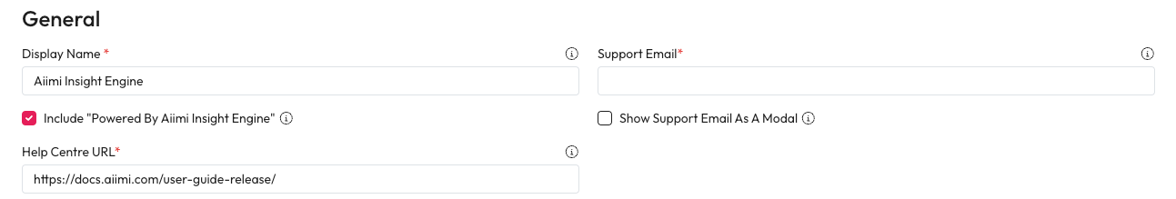
General
There are a number of settings to customise Workplace AI. You can change names, contact details, and branding.
Display Name - Enter the Display Name you want to use for Workplace AI.
You could change the name to match any internal naming conventions.
Support Email - Enter the Support Email to be used for support and queries.
There are a couple of ways users can contact admins, you can choose where they're sent.
Show Support Email As A Modal - Check this so users can see and copy the support email.
Include "Powered By Aiimi Insight Engine" - Check this to show this message within the system.
Help Centre URL - Enter the URL users are navigated to when they select "Visit the Help Centre".
ChatBot
ChatBot Name - Enter the name that will be used for the chatbot within your system.
ChatBot Description - Enter a description for the ChatBot.
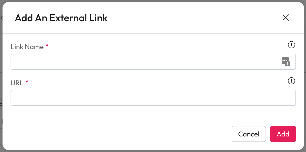
External Search Links
External search tool links can be added so users can quickly search that tool from Workplace AI.
Select Add Link to add new search tools to Workplace AI.
Link Name - Enter the External Search Link Name to add a new search tool in Link Name.
URL - Enter the URL for the External Search Tool.
This must be a valid link with a suffix of "q=".
Select Add.
You can edit or delete an existing search link from the external search link table.
Layout
We recommend testing images to ensure it contrasts well with the foreground before deploying.
Site Logo
Choose a logo to use in the navigation bar, on the login page. You can also customise where selecting the logo will take you. The logo will scale to fit within 150px wide by 24px high while maintaining aspect ratio.
Select Upload a Logo.
Within the modal, drag and drop the logo
Or
Select Upload a Logo.
Select Choose a file to open up your file explorer.
Navigation
Landing Page: Select this to take users to their landing page when they select the logo.
Custom Page: Select this to take users to a different URL when they select the logo.
Specify where users will be taken by entering the URL into the Custom page URL.
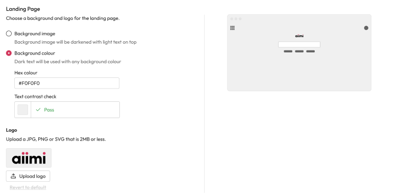
Landing Page Logo
The logo should be no more than 250px wide by 50px high. The image will be scaled to fit the maximum while maintaining aspect ratio. If you have a square logo which is 100px by 100px, it would be displayed as 50px by 50px on the landing page.
Select Upload a Logo.
Within the modal, drag and drop the logo
Or
Select Upload a Logo.
Select Choose a file to open up your file explorer.
Landing Page Background
Choose the type of background and the logo to use on the Workplace AI landing page.
Background image - Select this to use an image for your landing page background. It will use the Additional background Image used for the login page.
There is an overlay placed over background images to ensure any text remains legible no matter what type of image is used. There's no way to remove the background overlay if a background image is being used.
The background image is set to Fill the browser window, we recommend at least 1920x1080 for HD screens.
Background colour - Select this to use a colour for your landing page background.
Hex colour - Enter the hex code value for the colour you want to use for the background.
The text contrast check will check if this colour is accessible with our dark text.
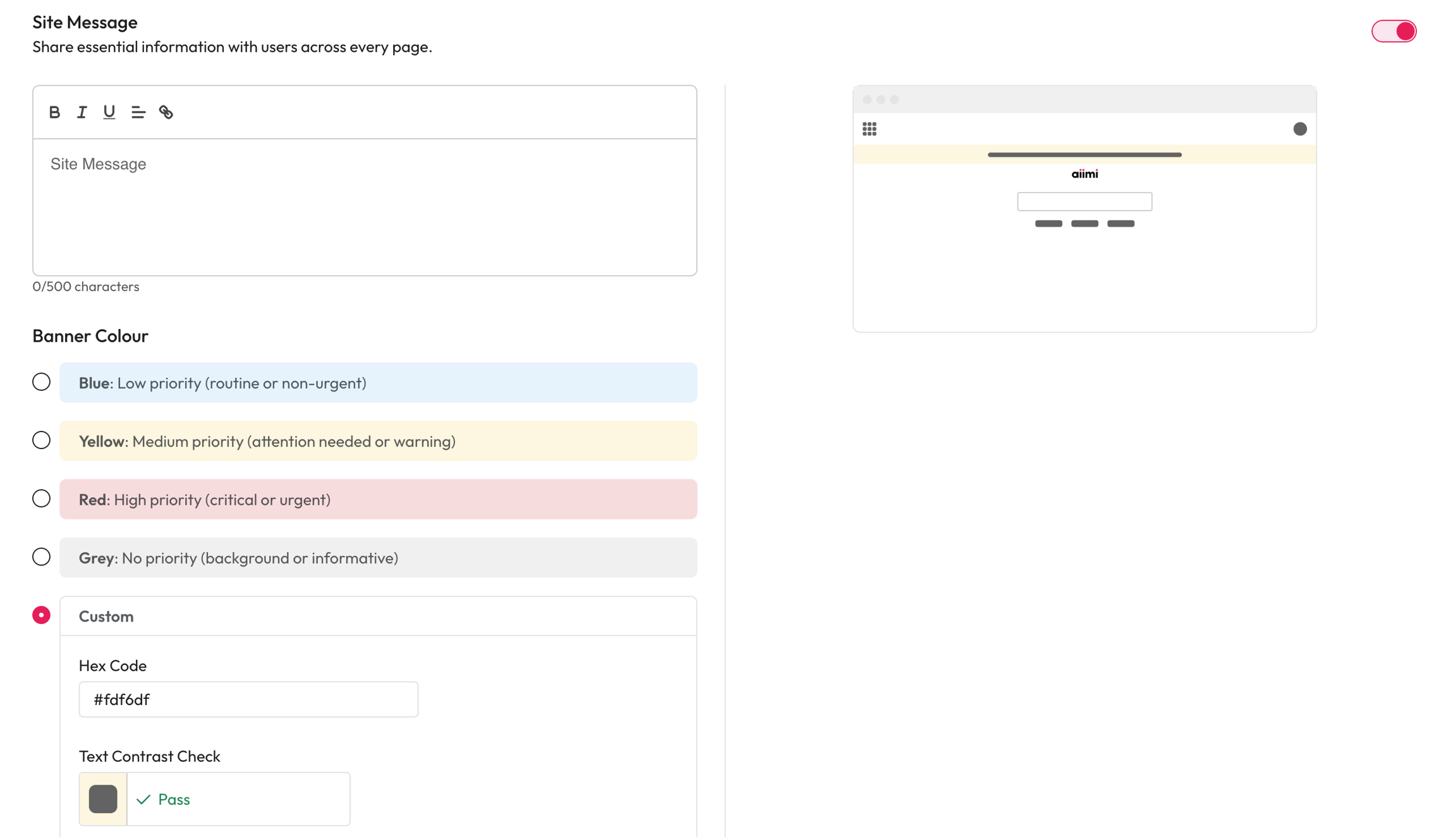
Site Message
This adds a message to the top of every users Workplace AI. You can share important information, updates or upcoming down time.
Turn on a site wide messages with the Toggle at the top of the page.
Site Message - Enter the text you want to be displayed across the application.
Banner Colour - Select the colour of banner.
Each colour has certain connotations in a users mind.
Blue - A routine message or sharing information.
Yellow - An action is required or important information.
Red - Some critical information or urgent action is required.
Grey - A neutral message for information only.
Custom Banner Colour
Hex Code - Enter the hex code of the colour you want to use.
This may be helpful if you have business standards for banners.
Text Contrast Check - This ensures that the hex code you enter passes the AA accessibility standard with the standard font colour.
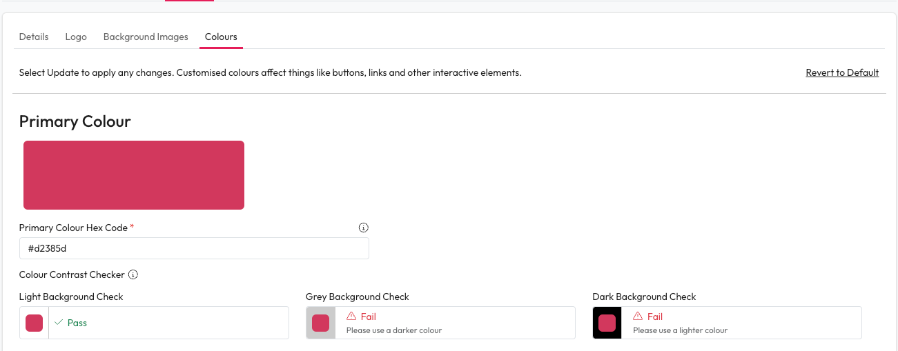
Colours
Customise the 3 main colours used across the system. We recommend these match your brand.
We recommend testing colour combinations for accessibility before deploying.
Enter the Hex Code for each colour type.
Primary - This affects the primary buttons. We recommend using your primary brand colour.
Please note, the button text is white and not customisable, please make sure your chosen colour meets accessibility standards for contrast.
You can check the colour contrast here: https://webaim.org/resources/contrastchecker/
Secondary - This affects a few UI elements around the application (for example, some hover states.
We suggest using a darker shade of your primary colour for consistency.
Tertiary - This is a legacy setting and currently does not impact the UI, so it can be left as is.
When you enter a colour checks will be done for the colour contrast.
This will tell you if the colours are WCAG AA accessible against the white, grey and black backgrounds used.
We recommend a minimum accessibility level of AA. Visit the WCAG website for more information on accessibility.